Tutorial for boxplot
Box-plot and violin plot
These words were typed according to wikipedia to let me know the concepts and descriptions. One can totally skip this part.
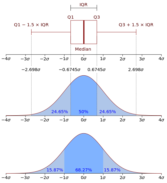
In descriptive statistics, a box plot or boxplot is a convenient way of graphically depicting groups of numerical data through their quartiles. Box plots may also have lines extending vertically from the boxes (whiskers) indicating variability outside the upper and lower quantiles, hence the terms box-and-whisker plot and box-and-whisker diagram. Outliers may be plooted as individual points.
Box plots display differences between populations without making any assumptions of the underlying statistical distribution: they are non-parametric. The spacings between the different parts of the box help indicate the degree of dispersion (spread) and skewness in the data, and identify outliers. In addition to the points themselves, they allow one to visually estimate various L-estimators, notably the interquartile range, midhinge, range, mid-range, and trimean. Boxplots can be drawn either horizontally or vertically. Wiki
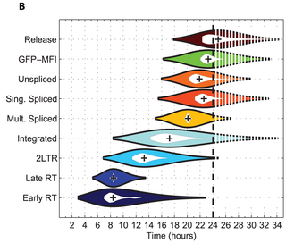
Violin plots are a method of plotting numeric data. A violin plot is a combination of a box plot and a kernel density plot. Specifically, it starts woth a box plot. It then adds a rotared kernel density plot to each side of the boxplot.
The violoin plots is similar to box plots, except that they show the prbability density of the data ad different values (in the simplest case this could be a hitogram). Typically violin plots will include a marker for the median of the data and a box indicaiting the interquantile range, as in standard box plots. Oberlaid on this box plot is a kernel density estimation. Wiki
How-to do the plot
Here I will introduce a script boxplot.sh as one-line command to plot various box-plots on given data.
Input file format
Two types of input files are supported. The first type is the table file with the first column as ID and other columns as data values, just as what you think in the mind. It is suitable when all boxes share same IDs. If each box contains different set of IDs, you may use the sceond format.
Matrix data table like diamonds as described in Basic things you should know to use s-plot.
The first column is the ID variable, normally the values in this column should be unqiue. The other columns are data columns and you can have any number of columns if you want.
  #filename diamond.extract.matrix
  ID  carat       cut color price
  1  0.23     Ideal     E 0.326
  2  0.21   Premium     E 0.326
  3  0.23      Good     E 0.327
  4  0.29   Premium     I 0.334
  5  0.31      Good     J 0.335
  6  0.24 Very Good     J 0.336
Molten format as described in Basic things you should know to use s-plot.
       cut color variable value
     Ideal     E    carat  0.23
   Premium     E    carat  0.21
      Good     E    carat  0.23
   Premium     I    carat  0.29
      Good     J    carat  0.31
 Very Good     J    carat  0.24
   Premium     D    price 2.757
     Ideal     D    price 2.757
      Good     D    price 2.757
 Very Good     D    price 2.757
   Premium     H    price 2.757
     Ideal     D    price 2.757
A practical example, if one want to compare the expression level of all genes in multiple samples, the table format is OK. Otherwise, if one only want to compare the expression distribution of top 100 genes in each sample, the molten format should be used since each sample may have different top 100 genes.
  #table file (faked value)
  Gene	ES_rpkm	iPS_rpkm Type
  Pou5f1  1.23     1.22  TF
  Tet1    0.21     0.20  Enzyme
  Tet2    0.23     0.24  Enzyme
  Tet3    0.01     0.01  Enzyme
  Nanog   1.31     1.30  TF
  #molten format
  gene	rpkm	sample	type
  Pou5f1	1.23	ES  TF
  Pou5f1	1.22	iPS  TF
  Tet1	0.21	ES  Enzyme
  Tet1	0.20	iPS Enzyme
  Tet2	0.23	ES  Enzyme
  Tet2	0.24	iPS Enzyme
  Tet3	0.01	ES  Enzyme
  Tet3	0.01	iPS Enzyme
  Nanog	1.23	ES  TF
  Nanog	1.22	iPS  TF
Begin plotting
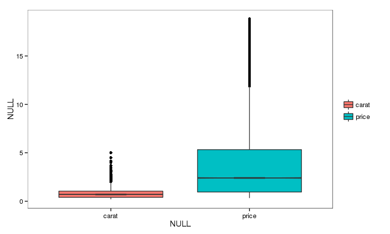
Simply, running boxplot.sh -f diamond.extract.matrix or boxplot.sh -f diamond.extract.matrix.melt -m TRUE will get the following boxplot.
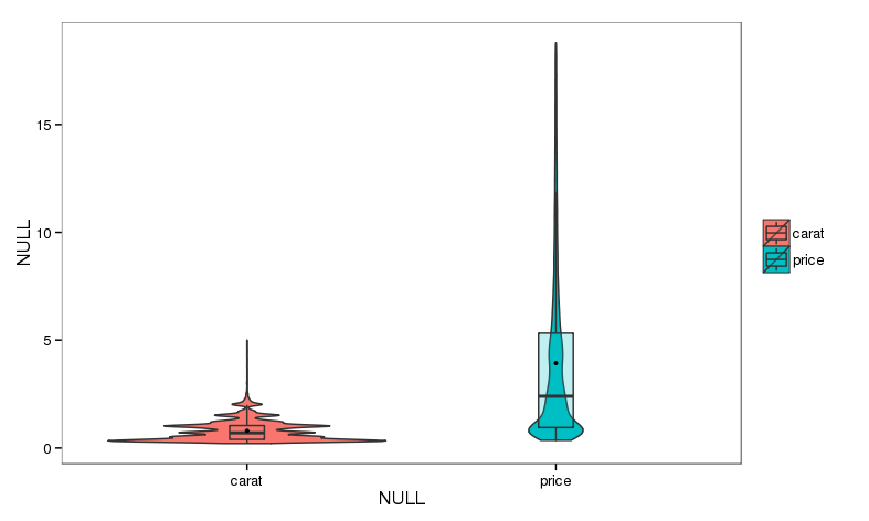
Also want to get the violin plot, boxplot.sh -f diamond.extract.matrix -V TRUE. If you do not want to plot the inner-boxplot, please give FALSE to -W.
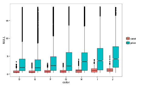
Plot the distribution of carat and price in each given category.
In cut category, boxplot.sh -f diamond.extract.matrix -a cut -I "'color'";
In color category boxplot.sh -f diamond.extract.matrix -a color -I "'cut'".
Remember to exclude other columns if there is any by giving their names to -I in format "'col1','col2'" or "'col'". Pay attention to the double quotation marks.
If the input file is in molten format, boxplot.sh -f diamond.extract.matrix.melt -m TRUE -d value -F variable -a color -I "'cut'" -x color or boxplot.sh -f diamond.extract.matrix.melt -m TRUE -a color -I "'cut'" -x color would be suitable since the default value for -d is value, -F is variable. For the practical example, rpkm should be given to -d and gene given to -F.
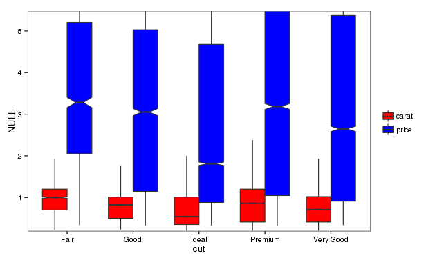
Manually set color for boxes in each category and exclude outliers to display clearly.
boxplot.sh -f diamond.extract.matrix -a cut -I "'color'" -x 'cut' -c TRUE -C "'red','blue'" -o TRUE.
For manual color setting, give TRUE to -c and color list to -C.
When -o is TRUE, outliers will be excluded. Default, points out [minimum/1.05, maximum*1.05] will be treated as outliers. One can give other numbers to -O when -o is TRUE to set other ranges of outliers.
Excluding outliers will be usefull for displaying data with very large ranges. Another way to do this is scale the Y-axis using log10 or log2.
Such as boxplot.sh -f diamond.extract.matrix -a cut -I "'color'" -x 'cut' -c TRUE -C "'red','blue'" -s TRUE -v "scale_y_log10()".
Giving TRUE to -s means executing scale y-axis. Strings given to -v indicates the way to transform y-axis, including scale_y_log10(),coord_trans(y="log10"), scale_y_continuous(trans=log2_trans()), coord_trans(y="log2"). You may also want to add a value like 1 given to -S to avoid to get log value for 0.
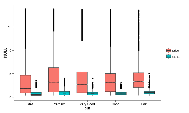
Set the order of boxes in one category or set the order of categories (default alphabetical order).
boxplot.sh -f diamond.extract.matrix -a cut -I "'color'" -l "'price','carat'" -L "'Ideal','Premium','Very Good','Good','Fair'" -x 'cut'.
For legend variable, the order should be given to -l. For category variable, the order should be given to -L. You may also want to rotate the x-tics to display vertically sometimes, please give -90 to -b.
Plot only the distribution of one column price in each category.
In cut category, boxplot.sh -f diamond.extract.matrix -r 70 -a cut -I "'color','carat'";
In color category boxplot.sh -f diamond.extract.matrix -r 70 -a color -I "'cut','carat'".
Remember to exclude other columns if there is by giving their names to -I in format "'col1','col2'" or "'col'". If you want to do this to molten files, please remove unneeded numerical columns before metling process using shell commands like grep -v and give new file to boxplot.sh.
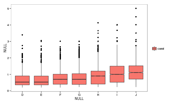
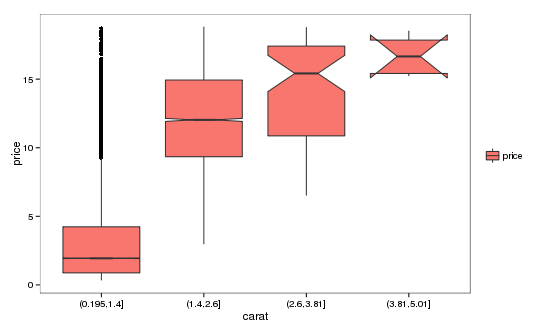
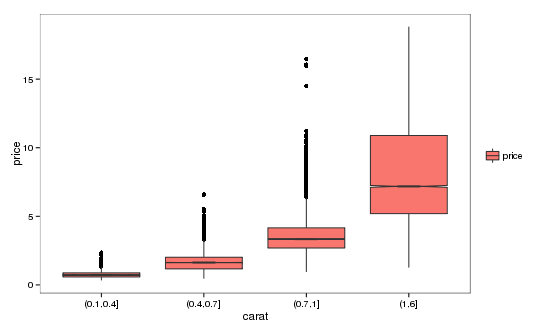
Plot the distribution of price in different carat categories.
boxplot.sh -f diamond.extract.matrix -a carat -I "'cut','color'" -B 4 -x 'carat' -y 'price'
or boxplot.sh -f diamond.extract.matrix -a carat -I "'cut','color'" -B "c(0.1,0.4,0.7,1,6)" -x 'carat' -y 'price'
The first command gives 4 to -B indicates splitting carat into 4 categories.
The second command gives numerical vector c(0.1,0.4,0.7,1,6) to -B to splie carat into given ranges.
Please see Basic things you should know to use s-plot to modify other formats like the position of legend, width, height, resolution and output type of pictures, install required module or generating R scripts only.
Ref
- ggplot2
- http://www.statmethods.net/graphs/boxplot.html
- http://stackoverflow.com/questions/2492947/boxplot-in-r-showing-the-mean
- http://stackoverflow.com/questions/10441214/r-boxplot-with-multiple-factor-labels
- http://stackoverflow.com/questions/10805643/ggplot2-add-color-to-boxplot-continuous-value-supplied-to-discrete-scale-er
